Dunning-Kruger
Apr 18, 2022
I recently read a blog post arguing that the Dunning-Kruger effect was not a psychological phenomenon but, rather, a statistical artifact.
For some context, the Dunning-Kruger effect is a well-known cognitive bias discovered and discussed by David Dunning and Justin Kruger in a 1999 paper. In short, the idea of the effect is that poor performers tend to overestimate their ability while skilled performers tend to underestimate their ability. The effect seems to have received wide-acceptance over time due to the ease with which their results have been reproduced in other areas. It also kind of just makes sense anecdotally; a lot of us have either been or seen that overconfident person learning a new subject.
On the other hand, the blog post referenced above strongly pushes against the psychological conclusions of Dunning and Kruger’s results, making the argument that the Dunning-Kruger effect is actually a statistical artifact. The general idea from that post is that Dunning and Kruger’s results only arise because we are trying to correlate some random variable, X, with a function of itself, Y-X. In the case of Dunning-Kruger, X were test scores subjects scored, and Y were test scores subjects think they scored. Y-X is the discrepancy between the predicted and actual scores which were observed to have trended downwards as subjects went from overestimating to underestimating as skill increased.
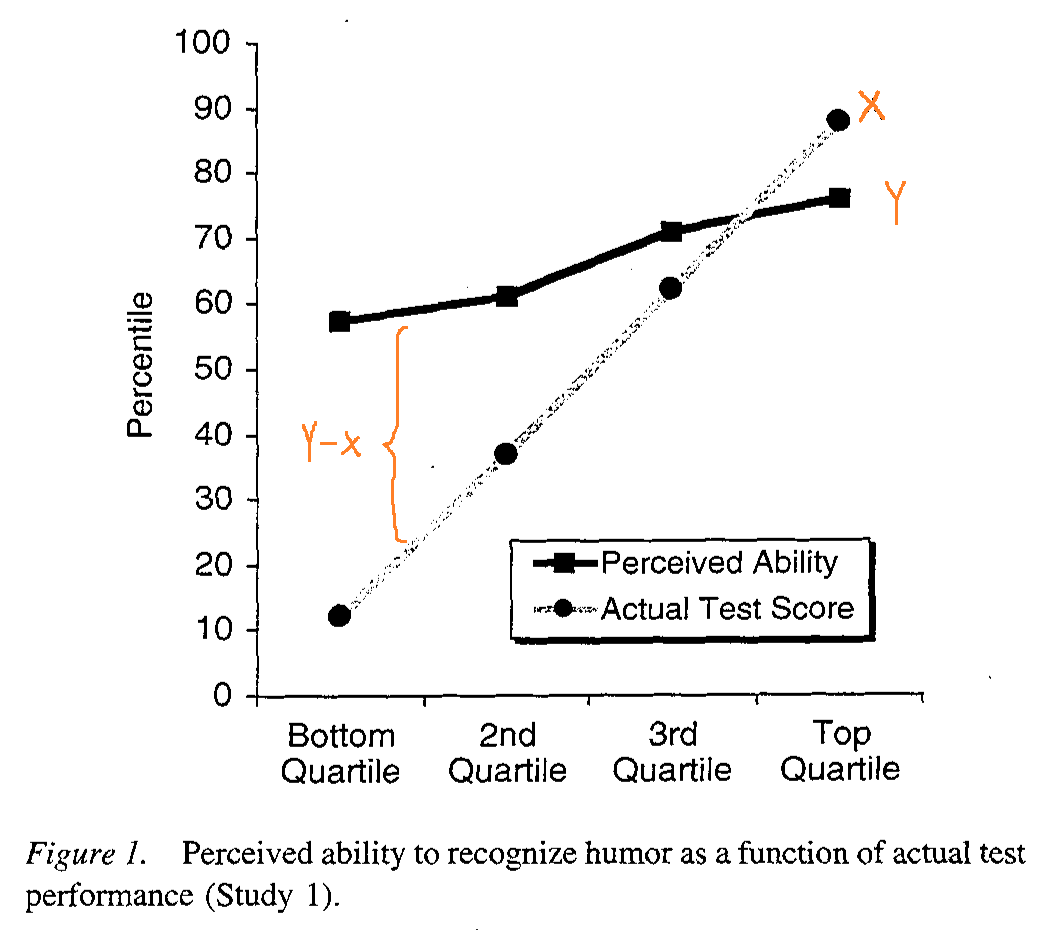
The author argues that because of the way these calculations were designed, we are guaranteed to observe some trend between the two variables we are comparing (X vs Y-X) due to the inherent correlation that exists between them rather than because there is some psychological effect at play (e.g. humans overestimating their abilities). The author then goes on to provide an experiment and some graphs to support his point.
This seemed like a very reasonable explanation, but I still had trouble accepting that the DK effect that many others, including myself, have taken to heart was just the result of some statistics. I wanted to try and recreate the author’s experiment and see it with my own eyes. Plus I wanted to see if I still had it in me to write some R.
An Experiment
We needed to setup a scenario with two independent random variables, X and Y (I ended up just making them standard normal distributions). Dunning and Kruger broke their participants up into quartiles based on their test scores, so I have done the same on the X variable.
library(dplyr)
library(ggplot2)

n <- 1000
x <- rnorm(n, 0, 1)
y <- rnorm(n, 0, 1)
x_quartiles <- cut(x, breaks=4, labels=c(1, 2, 3, 4))
After this, I calculated the averages for X and Y by quartile. R treats the quartiles as factors, so I also needed to convert them to a numeric vector.
df <- data.frame(x, y, x_quartiles)
avgs <- df %>%
  group_by(x_quartiles) %>%
  summarise_each(funs(mean))
avgs$x_quartiles <- as.numeric(avgs$x_quartiles)
Now it’s time to make some graphs.
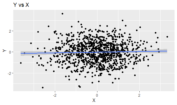
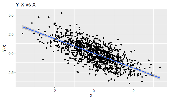
These are what the data points looked like. X and Y were not correlated, so graphing them just creates a cloud of points. X and Y-X have a negative correlation, so we see a downwards trend with some noise (produced by Y).
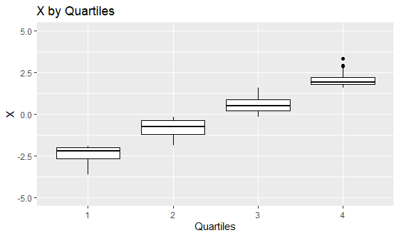
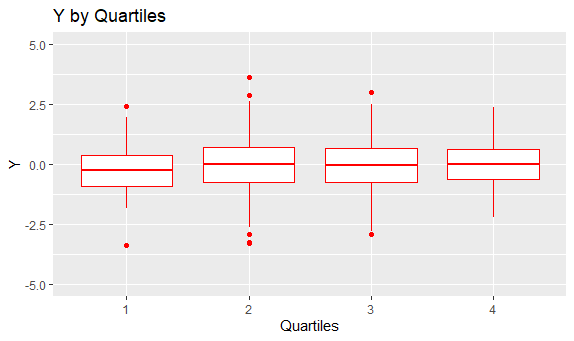
After the data points were grouped by quartile, I graphed a boxplot for each quartile. Since X is correlated with itself, the averages in the boxplots display a linear trend moving across quartiles. On the other hand, since X and Y are not correlated at all, the boxplots in each quartile look about the same compared to each other.
Graphing only the averages in each quartile and combining the graphs, we finally see something that is eerily similar to both what the author of the blog post and what Dunning and Kruger produced.
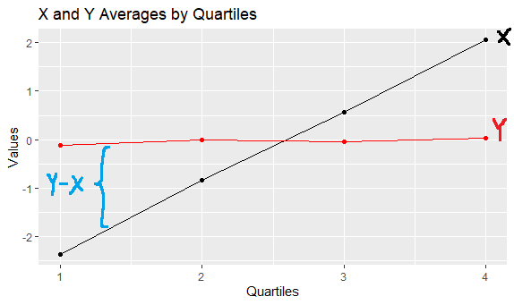
This graph roughly shows the correlation of X and Y to X (since the quartiles are just X split by group). The black line increases over the quartiles because X is effectively being graphed against X. Meanwhile, the red line appears flat since, because Y has no correlation with X. In each X quartile, the distribution of Y values remains roughly the same (quartiles 1 and 4 just represent fewer points since the probability of landing at the tails of a normal distribution is less likely).
A Statistical Artifact
The idea of DK being a statistical phenomenon is not new. The Dunning-Kruger effect Wikipedia page outright states that one of the criticisms for the Dunning-Kruger effect is regression to the mean.
One idea from regression to the mean is that after an initial sampling, performing a second sampling from the most extreme data points will still result in a mean that is close to the mean from the initial sample. For example, suppose I am interested in the distribution of test scores on a randomized true-false exam. If I made 100 students take a randomized true-false test, the expected mean score is 50%. If I then took the top 10 students from the 1st exam and made them take a different randomized true-false test, the expected score on the 2nd exam is still 50%. Since the answers are randomized, even though I took the top performers and made them take another test, the mean from the second testing is not extreme but, rather, still close to the mean from the first testing.
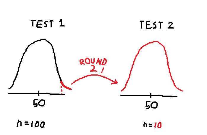
This is roughly what is happening with our experiment. We performed an initial sampling of a distribution (X) and broke the data points into quartiles where the 1st and 4th quartiles could be considered “extreme” data points. We then performed a second sampling on the same distribution (Y) and calculated the averages per group. Due to regression to the mean, the averages of Y look the same across all groups of X, despite some groups being more extreme than others in terms of X. This is because, in each group, the group averages of Y are regressing towards the overall mean of Y.
The real world implication is that, perhaps, the scores people get and the scores people guess they got have a discrepancy, not because of a difference in mental models between poor and skilled performers, but because these two variables are not really related at all. And why should they be related? All we know is that some people are very good at whatever test they took, not that they can make good judgments on how well they did.
So What Does It All Mean?
Do the Dunning-Kruger effect and its psychological conclusions really exist or not? I used to believe so, that it was because most people new to a field were overconfident, but after running this experiment, I’m not so sure. Maybe we all just suck at judgment. Even if a person is good at taking a test, what incentive (other than maybe avoiding hubris) do they have to accurately assess how well they did? When we self-assess our ability, how do we know that we aren’t just randomly picking numbers from a distribution in our head and that we are actually making a grounded and logical analysis?
Of course, when I questioned all of this to a friend, all they said was, “You’re thinking about this too much. People are just overconfident. I’ve seen them.”
And perhaps they are right. Dunning-Kruger effect or not, psychologically-based or statistically-based, humans are still humans, one more unique than the next. One can use broad experiments to draw conclusions about data points overall, but it doesn’t mean you’ve discovered something about how an individual acts. I suppose the only real way to do that is to go out there and talk to some folks.